Back to the Data: Building our Reporting with a Bespoke Power BI Solution
8 min read

Alex Bristow
Senior Project Manager

Introduction
We’re a unique company with unique needs.
To match our ambitions to grow, we need to be able to report across a number of business areas both internally and externally. How are we getting on? Are we on track? What does the future look like? Where are our pinch points?
We looked at several different off-the-shelf resourcing and reporting products, none of which satisfied all of our current needs or gave us the flexibility if they changed in the future.
So what did we have?
A Professional Services Automation (PSA) platform covering projects, resourcing, timesheets and invoicing.
A cumbersome sales forecast & sales pipeline in an Excel spreadsheet, that had to be updated frequently based on updates to projects in the PSA platform.
Internal financial calculations & reports were done manually based on exports from the PSA platform and Sales Forecast spreadsheets.
External project progress reports and internal portfolio reports that were entirely manual.
No visibility of all of our current and prospective project timelines in one place.
When & where we started
We started this process in the first quarter of 2024. First of all, we fell into the trap of “We need a new product, let’s look at what’s on the market”. We found some cool tools, but we had no way of knowing if any of them were the right tool for the job, so we quickly stepped back and identified what was absolutely key for us with a whiteboarding session:
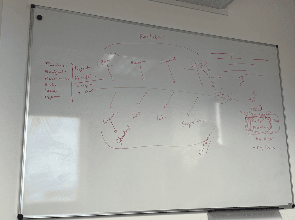
Our initial areas of focus were Resourcing, Planning, Financials and RAID. Based on the fact that we had the raw data relating to resourcing, planning and financials in the PSA platform, we decided to initiate a POC on leveraging the existing data that we already had.
Enter Power BI. A quick look at the integration documentation for the PSA platform gave us two main options to move the POC forward. REST APIs or connecting via Power BI with a SQL connection. One firewall port opening request later and we were off to the races with the SQL connection working successfully!
I started off by replicating a couple of simple existing reports that the PSA platform produced, which allowed me to familiarise myself with DAX - the formula language used to shape our data.
Putting it into production
As we work primarily with our clients in an Agile Software Development Lifecycle, we always want to get our products into the hands of real users as quickly as possible. It made sense to treat our reporting solution as a product and run it in roughly the same way. We didn’t feel the need to have daily stand-ups, but we did set goals of what we wanted to achieve over the next two weeks.
Once I published our first version to a Power BI workspace after 4 weeks, I held demo sessions with the Client Delivery team, Finance, the board and heads of department to show what we had achieved so far and that we had only scratched the surface of what the reports were capable of.
This also allowed us to experiment and test what resonated with users and what did not. Where to visualise data in charts, where to summarise data in cards and where to display detailed data in tables & matrix visuals, as different use cases required data to be consumed in different ways. At this point, I also leaned on our in-house UX expertise for best practices on visualising the data.
Creating a backlog & The death of Excel
Once we held our demo sessions with the various stakeholders within the business, it became clear to us quite quickly that finance was our number one stakeholder. Of the focus areas we previously identified, it had its own area and played a pivotal role in the other 3 focus areas - resourcing, planning & RAID. But where should we start?
I walked through each of the Excel files that Finance used, verified if the Excel file relied on data from the PSA platform and challenged whether it could be replaced with a Power BI report. This exercise gave us a healthy backlog of items that we could then prioritise and work through. These included:
Financial Year Sales Forecast
WIP
Monthly Turnover
Portfolio Financials, Profits & Margins
New Business Pipeline
I then ran through the same exercise with our other stakeholders to capture their off-system processes and calculations that centred on an export from the PSA platform. Which added the following items to the backlog:
Resource Profile - Next 6 Weeks
Resource Profile - Next 6 Months
FTE Capacity
Utilisation percentages & utilisation targets
Portfolio overview of key figures for all active projects, grouped by Project Manager
Leveraging AI to write DAX
By the end of 2024 and the explosion of ChatGPT and Co-Pilot, I was able to write and validate DAX measures without any syntax mistakes. By giving an aliased schema summary of tables and columns, I could ask for the DAX to be written using natural language and the ability to write all of the measures for our new, more complex reports was taking significantly less time to implement compared to manually writing simpler DAX measures.
I put the following rules in place:
Always use an alias for table/column names.
Never provide any connection details.
Never provide any real data rows.
Client-facing reports
After finishing our initial set of reports to Finance and entirely removing the need for Project Managers to also manually update any Excel files for our core reports, our previous discovery sessions had found that producing external financial reports for clients was an extremely time-consuming, manual process.
Much like ourselves, our different clients had different requirements for what we needed to report. We identified 2 client reports that could easily be replicated in Power BI and remove the overhead of manual data aggregation. However, they didn’t actually need as much data as our main internal reports.
So, I created a completely separate Power BI report for each of our client-facing reports, only loaded the core tables that were needed - Resourcing, Timesheets & Invoices, whilst stripping out things like User Postings, Annual Leave bookings, Internal Cost Rates. I then further streamlined the dataset during the ETL in Power BI’s Power Query to load only data for that particular client and from within the last 12 months.
These report packs are typically 4-5 pages, so once I had created a front cover page, the whole report could be exported as a clean GW-branded PDF report that could be sent out ahead of commercial and progress update calls.
I did consider automating the process from end-to-end and scheduling the report to be automatically emailed to the client. However, as the report contained commercial figures, we collectively decided that a GW Project Manager should still be responsible for doing a manual spot check before sending.
Tracking historical data
Our reports were providing massively improved visibility and giving us value, but it presented us with a new problem.
“Why has the revenue gone up (or down) £XXXX since last week?”
Looking at a snapshot of data in the database is great, but to answer questions like this, I had to be able to store this data and have the ability to compare it over time.
Enter Power Automate.
As we were publishing the Power BI Service, I could leverage Power Automate to take the key figures that were being calculated and store the data. This meant that the calculations and logic in the Power BI measures could all sit in one place and did not need to be duplicated (E.g. to write a routine to store to a local DB).
The process works as follows:
Power Automate Flow runs daily on weekdays at a certain time.
Power Automate Flow runs a DAX query against our published data in the Power BI Service.
Power Automate Flow creates a CSV file with summarised data totals & saves the CSV file in SharePoint.
Power BI loads the last 90 days of CSV files for this financial year back into a new Power BI table.
Data from this table is then presented in chart visuals and DAX measures created to compare the as-is total vs the historical total from 7 and 14 days ago, with any differences highlighted.
Enriching the data model with additional data sources
Our Power BI reports were now the source of truth for key financial information, such as the sales forecast in the financial year. However, we now wanted to layer on top our prospective sales pipeline for existing clients and new business. Our existing PSA platform did not support any kind of CRM functionality, so we had to look elsewhere.
The senior leadership team had already started to track our sales pipeline in an online CRM. The good news was that the key requirements, such as deal stages & percentage weighted values, had already been defined. The bad news was that the data was in a totally different format and we had to be able to map the Client IDs in the PSA platform to the Organisation IDs in the CRM.
I tackled this in three parts. Firstly, using Power Query to transform the REST API call to get the CRM into a similar format to the PSA platform. Secondly, I created a bridging table to map the Client IDs to the Organisation IDs. Thirdly, I joined the two sets of identical data together via DAX.
We could now include or exclude the weighted sales pipeline value from the Sales Forecast, whilst still being able to filter by existing clients, new business or by individual client.
Extrapolating data & producing trends
At this point, we started getting creative with the data we held and started to use the data to predict the future. I identified 3 areas where this could potentially add value:
Using the historical data from the last four weeks to predict where the final financial figures will be at completion.
Using the historical annual leave data over the past 3 years to predict the average number of working days per team for a given month.
Using the historical data from the last 3 quarters to predict against the annual targets.
Dashboards & KPIs
Every quarter, we have a company update (followed by pizza and snacks!). As part of this, the Senior Leadership Team addresses the company and gives everyone an update on how we are progressing against our annual objectives and how we performed in the quarter. A significant part of the data used to calculate the KPIs was already in our Power BI reports. However, as we had over 20 reports at this stage for various areas of the business, we needed to consolidate some of these into summary dashboards.
I had a new problem to solve first. How to enter quarterly and annual targets into our reports without hardcoding them in DAX. I created a SharePoint area for the SLT to be able to access and edit the targets’ reference data. This file would then be loaded into our Power BI reports as a data source.
Now that I had sorted the data inputs, I worked with the CEO and SLT to define a simple Data on Demand Dashboard that would:
Display the current & projected progress against the current quarter’s target.
Display the current & projected progress against the annual target.
Link through to the detailed breakdown of how that KPI was calculated.
In addition to displaying a single figure against each quarterly and annual target, I also displayed a Red/Amber/Green indicator, depending on the progress/projected progress.
Subscriptions, Notifications & Alerts
As we now had built dashboards, this meant that users could opt in to subscribe to them and be emailed the current figures. I also ran sessions with members of the SLT that were interested in building their own dashboards to pick out key figures and visuals that were applicable & tailored to their department.
We did also experiment with using alerts within Microsoft Teams, but after a short trial we found these to be quite overbearing and nowhere near as powerful as the built-in notifications that people could set up for themselves.
Pagination and Power BI Report Builder
Now that the SLT had readily available access to accurate calculated data at their fingertips. This meant that we could start to dive deep into key project information. However, putting detailed information about each project in an entire portfolio of over 30 inflight and upcoming projects on one screen was going to be impossible.
Luckily, the lesser known sibling of Power BI, Power BI Report Builder was at hand.
Power BI Report Builder is a standalone application designed to produce paginated reports. Perfect for producing multipage documents, such as an entire portfolio of over 30 inflight and upcoming projects. It’s essentially a fancy mail merge. The best part was, we could connect it straight away to the semantic model that we already had. So once I had figured out how to create a front cover, followed by a template for how we wanted the detail about each project on a page to look, it was relatively straightforward to produce and then publish to the same workspace to sit alongside our main report.
Where are we up to now & What’s next?
At the time of writing in May 2026, we have over 50 internal reports, 3 client-facing commercial reports, 5 central dashboards and 1 paginated project portfolio report. Many of these have gone through iterations of improvement, adding additional usability features such as filters/slicers and tooltips to explain what the data means.
Obviously, the next big thing we’d like to look at is where AI can fit in with this. Can it be used to assist with the ETL? Can we move further into predictive insights and analytics with it? How can we use natural language and conversational analytics without having to write more DAX? Could you have a conversation with AI to get to the answers quicker?
AI & Data
Product Management


